- Details
- Written by: Stanko Milosev
- Category: Android
- Hits: 4413
Example of button aligned to bottom of page:
<Button
	android:id="@+id/clickMe"
	android:layout_width="fill_parent"
	android:layout_height="wrap_content"
	android:layout_alignParentBottom="true"
	android:text="Click me"
	/>
Note line:
android:layout_alignParentBottom="true"
- Details
- Written by: Stanko Milosev
- Category: Android
- Hits: 4665
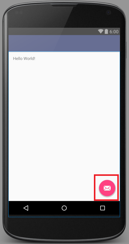
When you start new Android project, with SDK version 23, you will notice e-mail icon, like on picture:
Open activity_main.xml, in my case it is located in app\src\main\res\layout\activity_main.xml, and delete code:
<android.support.design.widget.FloatingActionButton
	android:id="@+id/fab"
	android:layout_width="wrap_content"
	android:layout_height="wrap_content"
	android:layout_gravity="bottom|end"
	android:layout_margin="@dimen/fab_margin"
	android:src="@android:drawable/ic_dialog_email" />
Then in MainActivity.java, in my case it is located in app\src\main\java\com\example\smi\myapplication\MainActivity.java delete code:
FloatingActionButton fab = (FloatingActionButton) findViewById(R.id.fab);
fab.setOnClickListener(new View.OnClickListener() {
	@Override
	public void onClick(View view) {
		Snackbar.make(view, "Replace with your own action", Snackbar.LENGTH_LONG)
				.setAction("Action", null).show();
	}
});
- Details
- Written by: Stanko Milosev
- Category: Android
- Hits: 7192
According to wikipedia SSDP is a network protocol for advertisement and discovery of network services and presence information. In another words, SSDP is used to broadcast message in order to discover devices. Message which I am sending through SSDP looks like:
M-SEARCH * HTTP/1.1\r\n
HOST: 239.255.255.250:1900\r\n
MAN: "ssdp:discover"\r\n
MX: 3\r\n
ST: urn:milosev:com:Stanko:1\r\n
Detailed explanation of headers you can read in this document.
Code in Android which I am using for sending M-SEARCH request looks like this:
        StrictMode.ThreadPolicy policy = new StrictMode.ThreadPolicy.Builder().permitAll().build();
        StrictMode.setThreadPolicy(policy);

        try {
            MulticastSocket s = new MulticastSocket(1900);
            s.joinGroup(InetAddress.getByName("239.255.255.250") );
            DatagramPacket packet = new DatagramPacket(DISCOVER_MESSAGE.getBytes(), DISCOVER_MESSAGE.length(), getBroadcastAddress(), 1900);
            s.setBroadcast(true);
            s.send(packet);
        } catch (IOException e) {
            e.printStackTrace();
        }
Where DISCOVER_MESSAGE is constant which looks like this:
    private final static String DISCOVER_MESSAGE = "M-SEARCH * HTTP/1.1\r\n"
            + "HOST: 239.255.255.250:1900\r\n" + "MAN: \"ssdp:discover\"\r\n"
            + "MX: 3\r\n" + "ST: urn:milosev:com:Stanko:1\r\n";
getBroadcastAdress is like:
    InetAddress getBroadcastAddress() throws IOException {

        Context mContext = getApplicationContext();
        WifiManager wifi = (WifiManager) mContext.getSystemService(Context.WIFI_SERVICE);
        DhcpInfo dhcp = wifi.getDhcpInfo();
        // handle null somehow

        int broadcast = (dhcp.ipAddress & dhcp.netmask) | ~dhcp.netmask;
        byte[] quads = new byte[4];
        for (int k = 0; k < 4; k++)
            quads[k] = (byte) ((broadcast >> k * 8) & 0xFF);
        return InetAddress.getByAddress(quads);
    }
Permissions in \app\src\main\AndroidManifest.xml which we need:
 <uses-permission android:name="android.permission.INTERNET" />
<uses-permission android:name="android.permission.ACCESS_WIFI_STATE" />
Code to receive messages looks like this:
StrictMode.ThreadPolicy policy = new StrictMode.ThreadPolicy.Builder().permitAll().build();
StrictMode.setThreadPolicy(policy);

try {
	MulticastSocket s = new MulticastSocket(1900);
	s.joinGroup(InetAddress.getByName("239.255.255.250") );
	DatagramPacket packet = new DatagramPacket(DISCOVER_MESSAGE.getBytes(), DISCOVER_MESSAGE.length(), getBroadcastAddress(), 1900);
	s.setBroadcast(true);

	while(true) {
		byte[] buf = new byte[1024];
		DatagramPacket receivePacket = new DatagramPacket(buf, buf.length);

		s.receive(receivePacket);
		String msg = new String(receivePacket.getData(), 0, receivePacket.getLength());
	}
} catch (IOException e) {
	e.printStackTrace();
}
---
Just one update, in order to receive answer it seems that I have to use same object for receiving, in my case I just placed code for receiving immediately under the code for sending request...
---
One more update, it seems that getBroadcastAddress is not needed, we can simply write InetAddress.getByName("239.255.255.250")
- Details
- Written by: Stanko Milosev
- Category: Android
- Hits: 4212
Simple "Hello World" dialog example in Android studio.
In my case I started new application, and left everything by default.
In content_main.xml (in my case it is located in \app\src\main\res\layout\content_main.xml) I added button:
<Button
	android:layout_width="wrap_content"
	android:layout_height="wrap_content"
	android:text="New Button"
	android:id="@+id/button"
	android:layout_below="@+id/textView"
	android:layout_alignParentLeft="true"
	android:layout_alignParentStart="true"
	android:layout_marginTop="53dp"
	android:nestedScrollingEnabled="false"
	android:onClick="testMessage"
/>
Here notice "android:onClick="testMessage""
Then in MainActivity.java (in my case it is located in \app\src\main\java\com\example\smi\msearch\MainActivity.java) I created method like:
public void testMessage(View view) {
	AlertDialog builder = new AlertDialog.Builder(MainActivity.this).create();
	builder.setTitle("Yo!");
	builder.setMessage("This is a test!");
	builder.show();
}